It’s Color Throwdown time again this week, and Denise is our hostess with this really pretty color combo!

Isn’t that a pretty picture? I’m not a purple fan, but I really think these colors are lovely. But…. I struggle with tone-on-tone colors like this, so I decided that less is more for my card today.

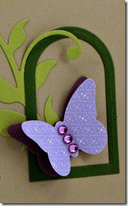
I saved this card months ago on one of my Pinterest boards and loved the simple wow-factor of it, so I decided to CASE the design for my card today. I cut my frame by using my Rounded Banner STAX Die-Namics and added the Medium Leafy Flourish and the Butterflies Die-Namics. The butterfly is accented with some lavender Kaisercraft rhinestones, and the sentiment is from the Vintage Cameo stamp set, stamped with Ranger Dusty Concord distress ink.
Be sure to visit my Throwdown sisters for more inspiration…
Barbara Anders Broni Holcombe Denise Marzec Joan Ervin Kerri Michaud Lori Tecler Lynn Put Wanda Cullen Miriam Napier, January Guest Designer
Thanks bunches for stopping by!


7 comments:
Love, love, love this stunning CAS card! Pinning this to CASE in the future! I bought the rounded banner dies and haven't really used them much, but love this window idea!
Cute card! I love this weeks color palette...hope to make a card myself!
This is such a pretty clean and simple card with these colors!!
Love this CAS beauty, Tammy!
I Love the pop of that purple against all the kraft. Lovely!
Gorgeous CAS design, Tammy....the layered butterfly is simply stunning!!!!
What an awesome CAS card, Tammy! (Love Kasia's card too!) The kraft card base really makes all the colors and shapes stand out beautifully!
Post a Comment